iGeeksBlog is discovering new things and exploring technologies are the ultimate things. iGeekBlog also does complete research for complex issues, we cover everything that can immensely bolster the user experience of Apple products.
It’ all about Apple so, we have carefully consider overall sense of Apple branding. We have taken clear black as brand color and we have customised typeface to give human connection and define bold, clean & fresh approach to talk all about of Apple but it has distinctive brand value of iGeeksBlog.
Brand identity

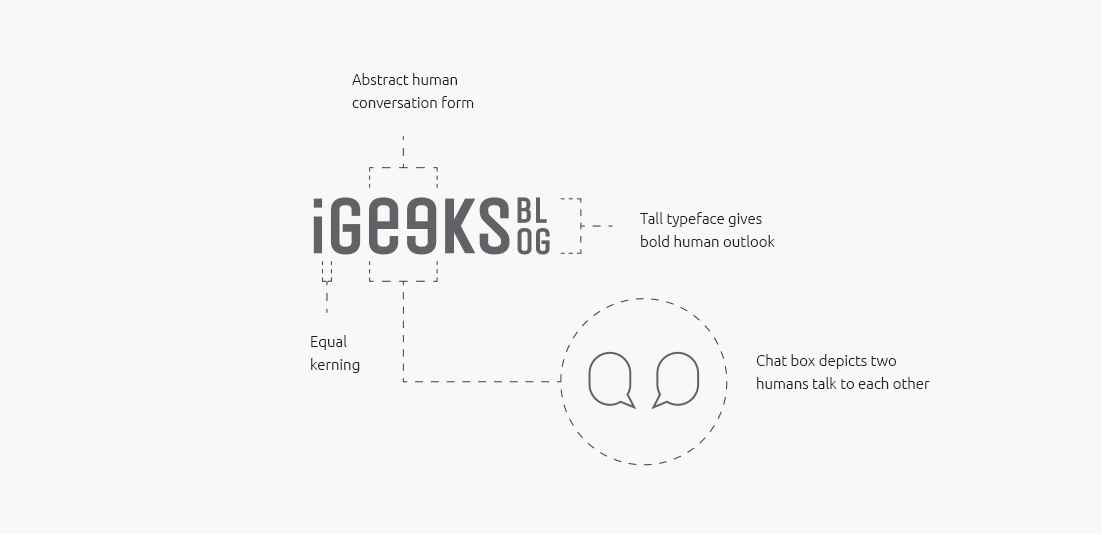
In this concept we have created tall typeface used to give sense of humanise feeling in logo.
“e” smartly tweaked in such that which depicts two human communicate with each other.

Visual Language
Color palette represent the overall sense of upper surface of ocean to deep bottom of ocean into gradient tone which give dynamic and diversified overall visual experience.


Keep browsing more Awesome Works
chhavi brand elevate llp
707, Gala Empire, Drive-in Road, Thaltej, Ahmedabad 380052 India
+91 79849 81321 +91 79 48005911 hi@chhavi.in
- ahmedabad .
- new delhi .
- surat .
- guwahati
